
By Lawrence G. McMillan
This article was originally published in The Option Strategist Newsletter Volume 13, No. 6 on March 25, 2004.
We have written about volatility many times in the past, but the “best” use of $VIX is that it spikes up to a peak when the market is collapsing, and then comes slicing back down when the crisis – whatever it is – has passed. Recently, in Volume 13, No. 4, we showed the entire history of $VIX, including the hypothetical history back into the 1980's. It is evident from that chart that spike peaks in $VIX are major buying opportunities. On a short-term basis, minor $VIX peaks are also good buying opportunities. The reason that this is true is generally that traders rush in to overpay for put options (insurance) when the market is collapsing. Imagine how expensive hurricane insurance would be if you waited until the clouds were on the horizon before purchasing it. The same thing applies in the stock market. When put premiums are cheap, as they were for the last eight months, no one wanted to buy them, but when the market broke down – exacerbated by terrorist fears – many rushed in to buy what had become relatively expensive puts.
So it is fear of loss that contributes to the sharp spike in $VIX. The contrarian investor waits for that fear to maximize – for $VIX to peak – and then steps in to buy the market amidst the chaos. This concept is fairly wellknown although I see it misinterpreted quite often (for example, some people use a fixed level of $VIX to gauge whether it’s at a panic peak, when in reality one must be far more dynamic than that).
Is today’s level of $VIX (fear) excessive? Look at the accompanying chart (Figure 1). You can immediately notice two things: 1) $VIX is nowhere near as high as it was in the past few years when major bottoms were being made, and 2) $VIX is still rising. Are these important?
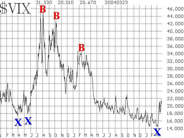
The second point is far more important. When looking for a buy signal, we should not be so concerned that $VIX is near 20 and not near 40, where it was when the major bear market bottoms were made in 2002. As stated earlier, a dynamic interpretation is required. So, wherever $VIX peaks, that will be a buy signal.
However, the second point – that $VIX hasn’t peaked yet – is very important. Last week, it almost looked like $VIX was going to leave a peak on its chart. But then the market collapsed even further and $VIX jumped to a new relative high. Thus, what we want to see is a clear peak on the $VIX chart before declaring that fear has become excessive. Hence, at this time, the answer to the question is “not yet.”
Having said that, what would constitute a peak in $VIX. Before answering, let me point out that it’s not necessary to identify the peak on the day or two that it occurs, for a true peak in $VIX is an intermediate-term buy signal, so it doesn’t matter if you miss the exact bottom by a couple of days. There is still plenty of time to make money, for the ensuing move should be large.
When $VIX first spiked up last week, I said that it needed to drop back below 17.50 in order to leave an obvious peak on the chart. It did not – even though it feinted at moving lower – and subsequently moved to the new relative highs where we find it now. Waiting for $VIX to fall all the way back to 17.50 from its recent peak near 22 is probably too excessive, so let’s modify that: a peak would be formed on the current $VIX chart if $VIX closes 3 points lower than its highest close. Note that in the long market decline (and accompanying $VIX rise) from March, 2002, through July 2002, $VIX never closed 3 points lower at any point during that time. Thus, if one used that rule of thumb during that time, he would have avoided buying prematurely even though $VIX made a series of new spike highs.
To date, the highest close has been 21.58 on Monday. So any close below, say, 18.50, should indicate that the maximum level of fear has passed and traders could consider that a buy signal if it happened. As a “stop” for that buy signal, one would use a new high in $VIX. In other words, if $VIX reversed upward again, and closed above 21.58, that would be the indication to get out of any longs you established when you thought $VIX had peaked.
Since the $VIX futures start trading tomorrow, one could also use this indication as a means of trading them. Those interested in using $VIX futures as a hedge need not be so concerned with short-term $VIX movements since the strategy is to own the futures as a hedge against loss in stocks that are held in one’s account. If you haven’t read our articles in the last few issues on hedging stock portfolios with a position in $VIX futures, please do so now for this is an extremely important concept that all stock holders should understand.
Another interesting item can be observed from the chart in Figure 1. Note the blue X’s at the bottom of the chart. Those are periods where $VIX made a low for at least 30 days in both directions. Those are points where the option trading public was quite complacent – they let premiums drift to such low levels because they expected the market to go nowhere. Again, thinking of this in contrarian terms, then, we would expect the market to go somewhere. And so far, it has.
What happens after that isn’t always predictable, and so we generally have to let the market show us the way. For example, the “X” in March, 2002, only kicked off a small move, but the one in May, 2002, was a much bigger move. In general, though, we know that we are embarking on a more volatile period and that is important to know as well.
About a year ago, we had looked at some comparisons between $VIX and 1) the implied volatility of stock options, and 2) the historical volatility of the $SPX Index ($VIX measures the implied volatility of the $SPX options). So, we’d like to update that data now. The accompanying charts – Figures 2 and 3 – show that updated data, and have about 10 years of history on them.
$VIX vs. VIXOEX
Figure 2 compares $VIX with the composite level of implied volatility on the stocks that comprise the $OEX Index. We call this VIXOEX. Figure 2 shows $VIX divided by VIXOEX.
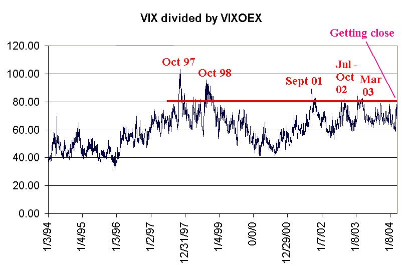
Most of the time this chart isn’t too interesting, as $VIX usually is about 40% to 80% of VIXOEX. That is, individual stock options have a higher implied volatility than $VIX does. There’s nothing noteworthy about that, since an index is always going to be less volatile than its individual stocks, since on any given day, some of the stocks in the index will be up while others will be down, and the net effect is lessened volatility for the index itself – and for its options
However, every now and then, the ratio will climb above 80, and that is usually a good buy point. The ones from the last few years are shown in Figure 2. Furthermore, you can see that the ratio got almost to 80 a couple of times last year (2003) and those were actually good buy points, too, although they aren’t shown on the chart.
Currently, the ratio is about 77%. Since this market is behaving quite negatively, I’d want to see this ratio actually get above 80% before turning bullish, but you can see that it is certainly near that level. Hence a buy signal might lie in the fairly near future.
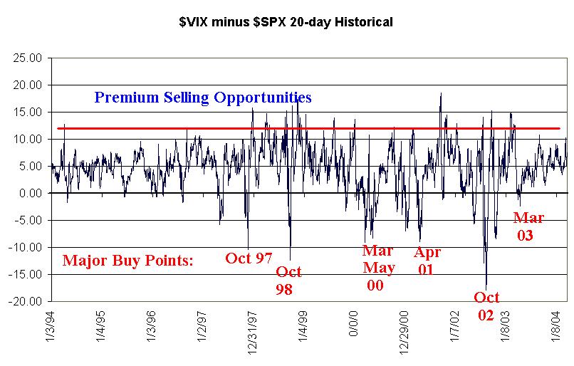
$VIX vs. Historical Volatility
The last chart (Figure 3) that we want to discuss is a comparison between $VIX and the historical volatility of the S&P 500 Index. This presents a slightly different slant on things – both from the actual $VIX chart (Figure 1) and the comparison chart (Figure 2).
Figure 3 shows that, most of the time, $VIX is higher than historical volatility. In other words, $SPX options are consistently overpriced by a small amount. The same is true of $OEX options, as we have often pointed out. Before one tries to assign blame for this, it should be realized that this is a natural result of the function of index options. They are so convenient as insurance – where a large portfolio can easily be hedged with just a single option order – that buyers are willing to pay a little more than theoretical value for them. Likewise, sellers have somewhat onerous margin requirements and thus demand a slightly higher price.
So, most of the time, the line in Figure 3 resides slightly above zero. If it gets too high – above 10 or 12 – then option selling opportunities are best. But, Figure 3 also shows one other interesting fact: when historical volatility shoots up well in excess of $VIX, those are buy signals for the broad market. Some of the more exceptional ones are marked along the bottom of the chart in Figure 3. Even ones that weren’t so extreme were still good buying opportunities. Consider March, 2003: historical volatility only edged above $VIX slightly, but when it did, that was a good buy signal for the entire market.
Currently the difference between $VIX and the historical volatility of $SPX is about +7. In other words, it’s not signaling either a good premium selling opportunity or a good market buying opportunity. But I think it’s important to note that it’s not about to give a buy signal – as perhaps Figures 1 and 2 are. This should serve to temper the bullish enthusiasm somewhat.
In summary, there is a good amount of fear in the market, but there should be since it’s gotten more volatile. We only view the longer-term charts, Figures 2 and 3, occasionally, but they aren’t really showing signs of excessive fear, either. So the answer to the question asked in the title of this article is a definite “no” Hence, while we might experience some oversold rallies – perhaps even sharp ones – you shouldn’t consider this a major buying opportunity based on excessive pessimism in the market – at least not yet.
This article was originally published in The Option Strategist Newsletter Volume 13, No. 6 on March 25, 2004.
© 2023 The Option Strategist | McMillan Analysis Corporation