
By Lawrence G. McMillan
This article was originally published in The Option Strategist Newsletter Volume 9, No. 8 on April 27, 2000.
In the past year or two, there have been many references in this newsletter to the fact that stock prices don’t conform to the lognormal distribution, which is the distribution used in many mathematical models that are intended to describe the behavior of stock and option prices. This isn’t new information to mathematicians – papers dating back to the mid-1960's have pointed out that the lognormal distribution is flawed. However, it isn’t a really terrible description of the way that stock prices behave, so many applications have continued to use the lognormal distribution.
Since 1987, the huge volatility that stocks have exhibited – especially on certain explosive down days such as the Crash of ‘87 or the mini-crash of April 14th (a couple of weeks ago) – has alerted more people to the fact that something is probably amiss in their usual assumptions about the way that stocks move. The lognormal distribution “says” that a stock really can’t move farther than three standard deviations (whether it’s in a day, a week, or a year). Actual stock price movements make a mockery of these assumption, as stocks routinely move 4, 5, or even 10 standard deviations in a day (not all stocks, mind you, but some – way more than the lognormal distribution would allow for). Longtime subscribers of The Option Strategist know these facts, of course, since we have pointed them out in detail in several past articles – most notably Vol. 8, Nos. 7 and 23).
We have long been telling you – our customers – that option selling is a dangerous strategy (covered or not) because of the possibilities of huge stock price movements. The odds lie with the buyer of options, especially if those options are underpriced when purchased. The reason is that these outrageous moves (which are more prevalent in stocks than in indices or futures) can destroy a naked option writer, but can be of great benefit to an option buyer.
In order to further quantify these thoughts, computer programs were written to analyze our database of stock prices, going back over six years. As it turns out – and as you will see – that is a short period of time as far as the stock market is concerned. While it is certainly a long enough time to provide meaningful analysis (there are over 2.5 million individual stock “trading days” in that data base), it is a biased period in that the market has been going up for most of that time. However, somewhat surprisingly, there were more extreme downside moves than upside moves.
The "Big" Picture
The first part of the analysis that I want to share with you is that the total distribution of stock prices conforms pretty much to what I had expected to find – and not surprisingly – to what others have written about the “real” distribution of stock prices. That is, there is a much greater chance of a large standard deviation move than the lognormal distribution would indicate. The high probabilities on the ends of the distribution are called “fat tails” by most mathematicians and stock market practitioners alike. These “tails” are what get option writers in trouble – and perhaps even leveraged stock owners – because margin buyers and naked writers figure that they will never occur. This is not intuitively obvious. The graphs on page 3 show this total distribution. The top graph is that of the lognormal distribution and the actual distribution – using the data in our database – overlaid upon each other. The actual distribution was drawn using 30-day moves (i.e., the number of standard deviations was computed by looking at the stock price on a certain day, and then where it was 30 calendar days later). The X-axis (bottom axis) shows the number of standard deviations moved. Note that the curves have the shape of a normal distribution rather than a lognormal distribution, because the X-axis denotes number of standard deviations moved rather than stock prices themselves (for this reason, the term “normal” will be used in the remainder of this article; it should be understood that it is the distribution of standard deviations that is “normal”, while the distribution of the stock prices measured by those standard deviation moves is “lognormal”). The Y-axis (left axis) shows the “count” – the number of times out of the 2.5 million data points computed that each point on the Xaxis actually occurred (in the case of the “actual” distribution) or could be expected to occur (in the case of the “normal” distribution). The notation on the Y-axis shows the actual count divided by 10. So, for example, the highest point (0 standard deviations moved) for the “normal” distribution shows that about 95000 times out of 2.5 million, you could expect a stock to be unchanged at the end of 30 calendar days.
At first glance, it appears that the two curves have almost identical shapes. Upon closer inspection, however, it is clear that they do not, and in fact some rather startling differences are evident.
"Fat Tails"
The graph below shows the “fat tails” quite clearly; both have been “zoomed in” on to show you the stark differences between the theoretical (“normal”) distribution and actual stock price movements. Consider the downside (the lower left circled graph on page 3). First, note that both the “actual” and “normal” graphs lift up at the end – the leftmost point. This is because the graph was terminated at –4.0 standard deviations, and all moves that were greater than that were accumulated and graphed as the leftmost data point. You can see that the “normal” distribution expects fewer than 200 moves out of 2.5 million to be of –4.0 standard deviations or more (yes, the “normal” distribution does allow for moves greater than 3 standard deviations – they just aren’t very probable). On the other hand, actual stock prices – even during the bull market that has been occurring during the term of the data in this study – fell more than –4.0 standard deviations nearly 2500 times out of 2.5 million. Thus, in reality, there is really more than 12 times the chance (2500 vs. 200) that stocks will suffer a severely dramatic fall, when comparing actual vs. theoretical distribution. Also, notice in that lower left circle, that the actual distribution is greater than the normal distribution all along the graph.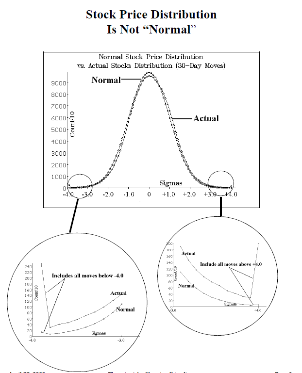
The upside “fat tail” shows much the same thing – actual stock prices can rise farther than the normal distribution would indicate. At the extreme – moves of +4.0 standard deviations or more – there were about 2000 such moves in actual stock prices, compared with less than 100 expected by the normal distribution. Again, a very large discrepancy, twenty-to-one.
Inflection Points
If the actual distribution is higher at both ends, it must be lower than the normal distribution somewhere because there are only a total of 2.5 million data points plotted. It turns out – in this case – that the normal distribution is higher (i.e., is expected to occur more often than it actually does) between –2.5 standard deviations and +0.5 standard deviations. Those are the points where the two curves cross over each other – the inflection points. Outside of that range, the actual distribution is more frequent than it was expected to be.
My “gut” reaction is that our data reflected an overly bullish period. That is, actual stock prices rose farther than they were expected to – not necessarily at the tails – but in the intermediate ranges, say between +0.5 and +1.5 standard deviations. This does not change the results of the study as far as the “tails” go, but one may not always be able to count on intermediate upside moves being more frequent than predicted.
“Side Benefits” of This Study In the course of doing these analyses, a lot of computer power was “burned”. Unfortunately our computers are PC’s and not those designed by Seymour Cray or Gene Amdahl (for those of you not familiar with those names, they are generally recognized to be among the premier original designers of the largest super-computers). So one pass through the data base takes about three hours. Thus, we tried to make it “count” as much as possible and accordingly a lot of smaller distributions were saved when they were calculated.
One of these is the distribution on any individual trading day that was involved in the study. Now, one must understand that one day’s trading only yields about 3000 data points (there are about 3000 stocks in our data base), so the resulting curve is not going to be as smooth as the ones shown on page 3. Nevertheless, some days could be interesting: for example, the day of the mini-crash, Friday, April 14th, 2000. The distribution graph is shown below.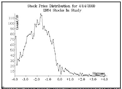
First of all, notice how heavily the distribution is skewed to the left; that agrees with one’s intuition that the distribution should be on the left when there is such a serious down day as 4/14/2000. Also, notice that the last data point – representing all moves of –4.0 standard deviations and lower – shows that about 750 out of the 2984 stocks (see 2nd line of graph title) had moves of that size! That is unbelievable and it really points out just how dangerous naked puts and long stock on margin can be on days like this. No probability calculator is going to give much likelihood to a day like this occurring, but it did occur and it benefitted those holding long puts greatly, while it decimated others.
In addition to distributions for individual dates, we also have distributions for individual stocks. The graph for IBM is shown below. Both this and the following graph depict 30-day movements in IBM.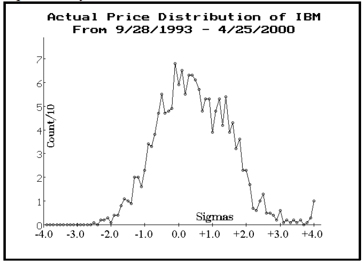
This graph perhaps shows even more starkly how the bull market has affected things over the last six-plus years. There were over 1600 data points for IBM (i.e., daily readings), yet the whole distribution is skewed to the right. It apparently has been able to move up quite easily throughout this time period. In fact, the worst move that occurred was one move of –2.5 standard deviations, while there were about ten moves of +4.0 standard deviations or more. Consider the longer-term distribution of IBM prices, going all the way back to March, 1987: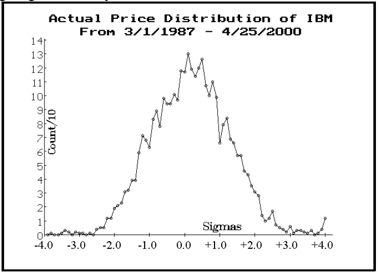
It’s clear that this longer-term distribution conforms more closely to the normal distribution – in that it has a sort of symmetrical look, as opposed to the previous graph above, which is clearly biased to the right (upside). These two graphs have implications for the “big picture” study, shown on page 3. Our database for most stocks only goes back to 1993 (IBM is one of the exceptions), but if the broad study of all stocks were run using data all the way back to 1987, it is certain that the “actual” price distribution would be more evenly centered – as opposed to its justification to the right (upside). That’s because there would be more bearish periods in the longer study (1987, 1989, and 1990 all had some rather nasty periods). Still, this doesn’t detract from the basic premise that stocks can move farther than the normal distribution would indicate.
What This Means For Option Traders
The most obvious thing that an option trader can learn from these distributions and studies is that buying options is probably a lot more feasible than conventional wisdom would have you believe. The old thinking that selling an option is “best” because it wastes away every day is false. In reality, when you have sold an option, you are exposed to adverse price movements and adverse movements in implied volatility all during the life of the option. The likelihood of those occurring is great, and they generally have more influence on the price of the option in the short run than does time decay.
Another thought that comes to mind is that we could provide several different kinds of distributions – including even individual stock distributions – in future versions of our Probability Calculator 2000. You could select the normal distribution, or one with fat tails, or one with a bullish bias (if you expected continued bullish markets, such as we have seen in the past six years) and so forth. The possibilities are large.
I have some qualms about using the past distribution as a forward projection for an individual stock, because it could easily change. That is, there are so few data points (comparatively speaking) in only one stock’s distribution, that they might not really be representative of what could happen in the future. Nevertheless, it might provide an additional piece of input for a trader before a position is established, as long as it is not accepted as “gospel”.
You might ask, “but doesn’t all this recent volatility just distort the figures – making the big moves more likely than they ever were, and ever will be again?” The answer to that is a resounding, “NO!” The reason is that the current 20-day historic volatility is used on each day of the study in order to determine how many standard deviations each stock moved. So, right now, that is a high number and it therefore means that the stock would have to move a really long way to move 4 standard deviations. Back in 1993, however, when the market was in the doldrums, historic volatility was low and so a much smaller move was needed to register a 4–standard deviation move.
To see a specific example of how this works in actual practice, look carefully at the lower chart of IBM on page 4 – the one that encompasses the crash of ‘87. Don’t you think it’s a little strange that the chart doesn’t show any moves of greater than –4.0 standard deviations? The reason is that IBM’s historic volatility had already increased so much in the days preceding the crash day itself, that when IBM fell on the day of the crash, its move was less than –4.0 standard deviations (actually, its oneday move was greater than –4 standard deviations, but the 30-day move – which is what the graphs on page 3 depict – was not).
Summary
It is important that option traders, above all people, understand the risks of making too conservative of an estimate of stock price movement. These risks are especially great for the writer of an option (and that includes covered writers and spreaders, who may be giving away too much upside by writing a call against long stock or long calls). By quantifying past stock price movements, as we have done in this article, hopefully you are convinced that “conventional” assumptions are not good enough for your analyses. This doesn’t mean that it’s okay to buy overpriced options just because stocks can make large move with a greater frequency than most option models predict, but it certainly means that the buyer of underpriced options stands to benefit in a couple of ways. Conversely, an option seller must certainly concentrate his efforts where options are expensive, and even then should be acutely aware that he may experience larger-than-expected stock price movements while the option position is in place.
This article was originally published in The Option Strategist Newsletter Volume 9, No. 8 on April 27, 2000.

© 2023 The Option Strategist | McMillan Analysis Corporation